Imagine a world where researchers in completely different fields interacted with each other freely. Consider how unexpected connections between the humanities and the sciences might inform research projects in new and serendipitous ways. Now think about how college and university research departments so often function within a silo structure, rarely making meaningful cross-disciplinary connections. A new initiative at Concordia University in Montreal, Canada aims to break down the silos and connect researchers without regard to faculty boundaries.
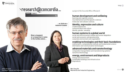
The benefits of cross-pollination in innovation are well known. In fact, the phrase “interdisciplinary innovation” yields 14.5 million hits on Google. It seems like everybody knows that innovation is a natural by-product of connecting disparate areas of inquiry, but figuring out how to foster and facilitate it is a challenge. The Concordia Office of Research recently launched a beta version of Research@Concordia, a web app that allows users to explore all the areas researched across all disciplines at the school and discover the connections and common threads.
The interface for the site is innovative and beautiful, using a combination of search and browse to allow the user to drill deeply to a high level of detail based on tags/keywords. Users can initiate an exploration session using a familiar keyword or name search entered in a search field, but the real fun is in clicking on a research cluster and delving deeper into the world clouds that result, creating an ever more targeted search as keywords are added by clicking on a choice in the word cloud. The current search terms are shown as breadcrumbs at the top of the screen, and at any time the user can choose to go straight to the list of researchers that fit the currently defined category. I encourage you to go play with it – descriptions don’t do it justice.

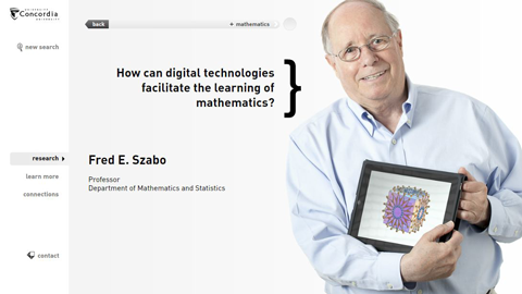
When the user arrives at an individual researcher profile, the visual design of the site starts to take centre stage. Each researcher is represented with a very professionally photographed shot that seems to capture their personality, and a question that their research seeks to answer. The whole effect is to create a very human connection with the researcher. From this profile page, the user can explore an even more fine-grained word cloud specific to the researcher, or explore their connections, either current collaborators or researchers with similar interests.
The UI for the site is very fluid and allows, encourages and rewards exploration. I found myself wandering down back-alleys of research I would never have imagined existed, navigating in and out with ease. It seems an ideal way for university insiders to identify others working in their field of interest but in a different discipline, and invaluable for outsiders to identify relevant contacts.
This site is an exciting first step by the Concordia Office of Research to show leadership in making their research and researchers more accessible. The site is a beta version, developed in Flash for ease of implementation. High on the list for the final release will no doubt be a port to javascript/html to allow wider accessibility (looking at you, idevices). The site was developed over the course of the last year and a half using the coding and design skills of a team of three undergrad students/recent grads, with creative and technical direction through lab six and a half at Concordia.
An impressive effort from Concordia that colleges, universities, and cultural/scientific institutions worldwide will want to have a very close look at if they’re serious about fostering innovation.
__________________________________
Like this? More from the user experience category.
Follow me on Twitter (@intudes) for interesting links and occasional observations.
Subscribe to the RSS feed, and don’t miss another post.
Pingback: Alta Google?